












Featured case study
AI-Driven Storytelling Platform
An AI-powered platform that helps people, families and communities turn their memories into professionally designed, printed books.
Read the case study
One shared set of styles and components so your product looks consistent and ships faster.
Stack we work in
Figures as of Oct 2026
Trusted by
A design system is the shared kit your designers and developers build every screen from: colors, type, spacing, icons and ready-made components, plus the rules for using them.
With one in place, new features take less time to design and build, screens look and behave the same across web and mobile, and fixes happen once instead of in fifty places. We build design systems end to end: Figma libraries with variables, design tokens that sync to code, component libraries in React or Flutter, and documentation in Storybook that your team will use.
Every team has built its own buttons, modals and form fields, and they look slightly different on every page.
Developers rebuild common UI for each feature instead of picking a tested component off the shelf.
Colors and fonts are hard-coded across hundreds of files, so any change to the look means weeks of work.
Figma files no longer match what is live, and nobody is sure which one is right.
Contrast, focus and keyboard bugs are fixed page by page and reappear in new features.
Outcomes
Foundations, variables, components and page patterns, published as a shared library.
A token set with transforms to CSS, Tailwind, Flutter or native formats, synced through GitHub.
Tested React or Flutter components, versioned and published as a package.
Interactive documentation with examples, props, states and usage rules.
How to propose, review, release and deprecate components.
A ranked plan to move existing screens onto the system with the least disruption.
Keep a growing product consistent as new squads and features are added.
Learn moreShare tokens and patterns between a React web app and Flutter mobile apps.
Learn moreServe several brands or client themes from one component library and token set.
Build the system first, then redesign screens from it so the new look stays consistent.
Learn moreStart from what you already have.
A library designers enjoy using.
Built with
One source of truth from Figma to code.
Built with
Components developers can install and trust.
Built with
A system people follow, not a file nobody opens.
Built with
Since 2018 we have delivered 680+ projects for 310+ clients, and 98% of clients keep working with us.
We build the Figma library and the coded components in one team, so design and code stay in sync.
We use Figma variables and design tokens that export straight into your code.
Components are designed and tested against WCAG 2.2 AA, so every product built on them starts accessible.
We document usage and contribution rules so your teams can maintain and extend the system.
Featured case study
An AI-powered platform that helps people, families and communities turn their memories into professionally designed, printed books.
Read the case study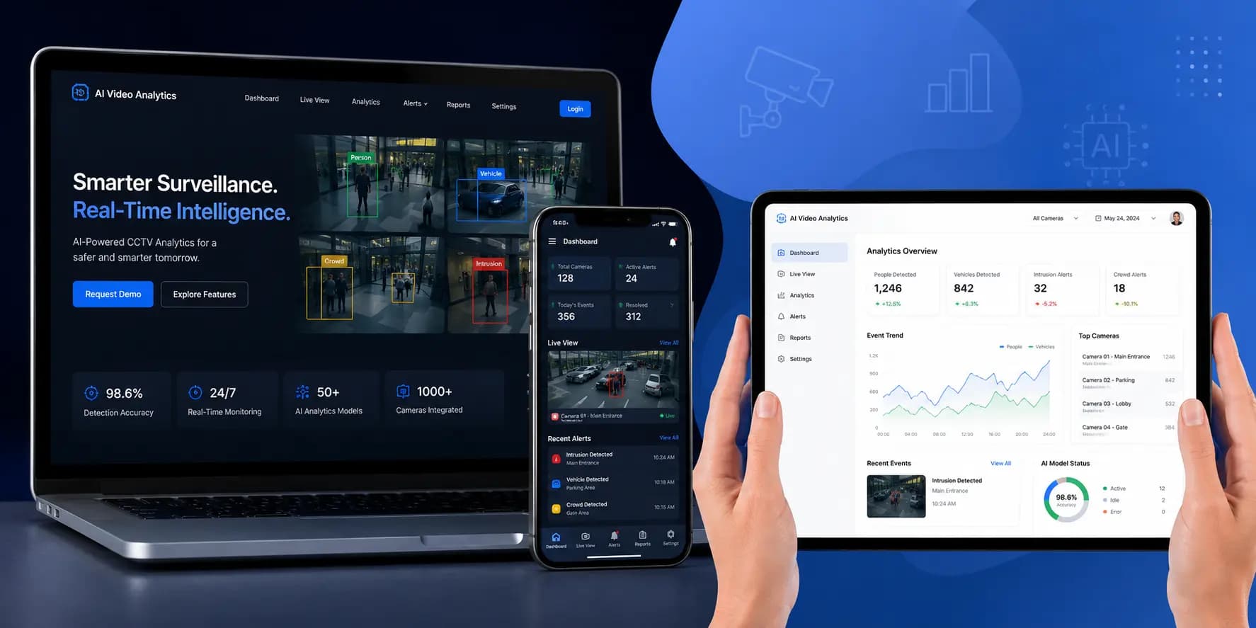 AI Video Analytics CCTV Intelligence Development
 Building a Real-Time Sports Data & Community Intelligence Platform
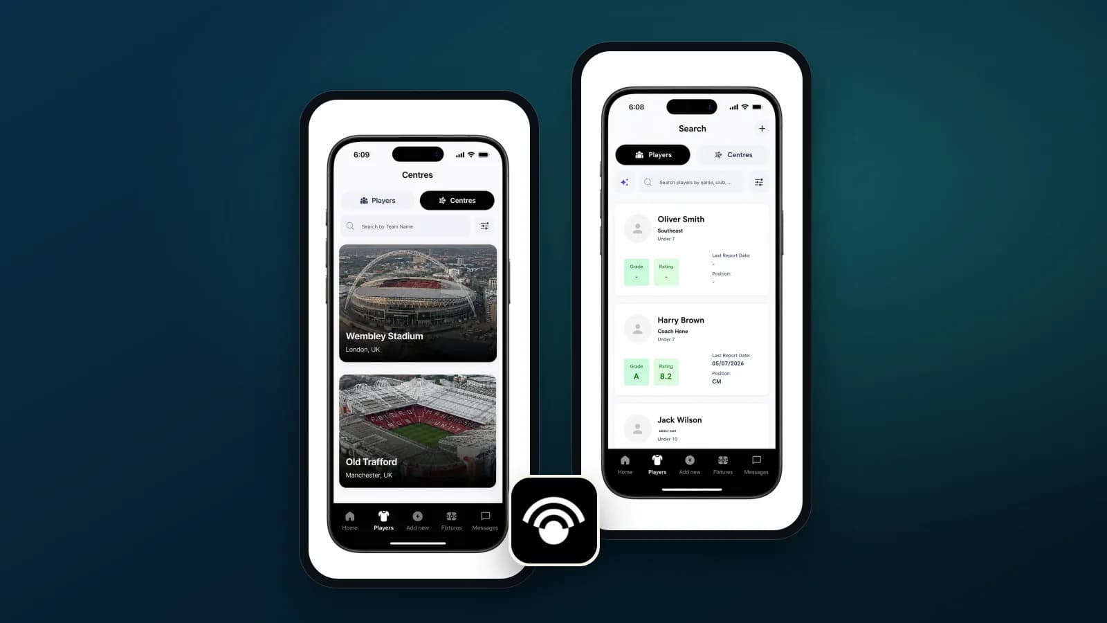 BallWatch – Football Academy Scouting and Recruitment App
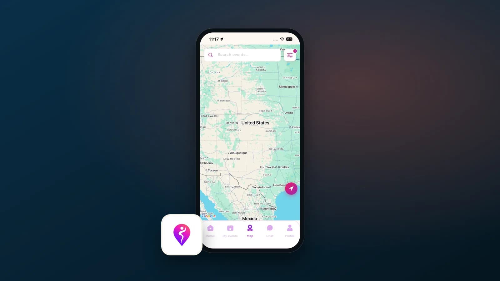 Dancespot – Mobile Application & Web Portal Development
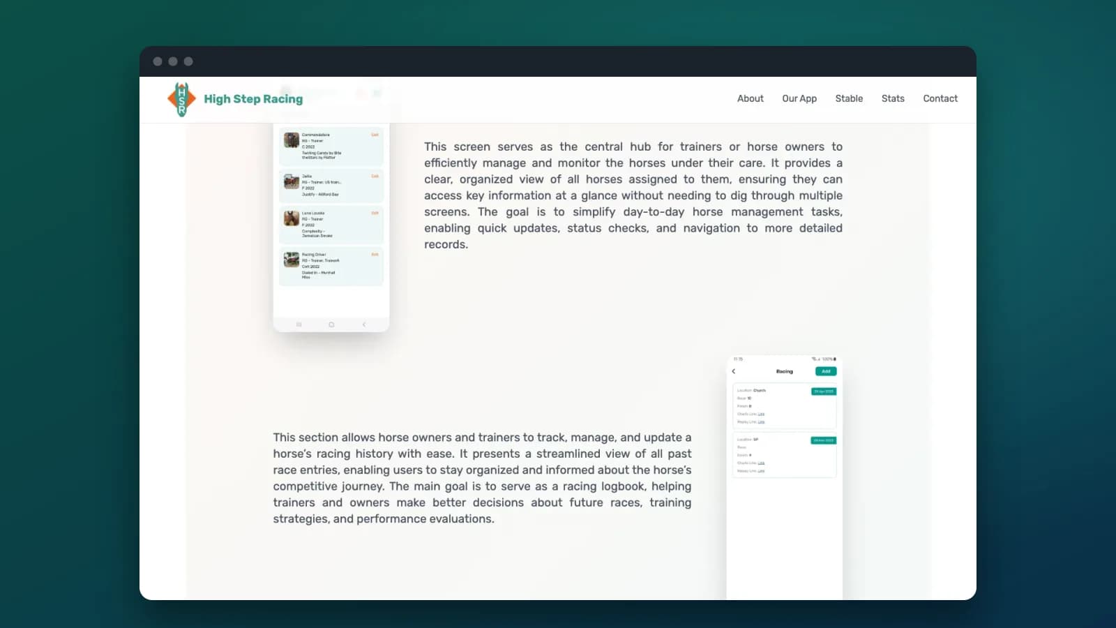 High Step Racing – Horse Management App for Owners and Trainers
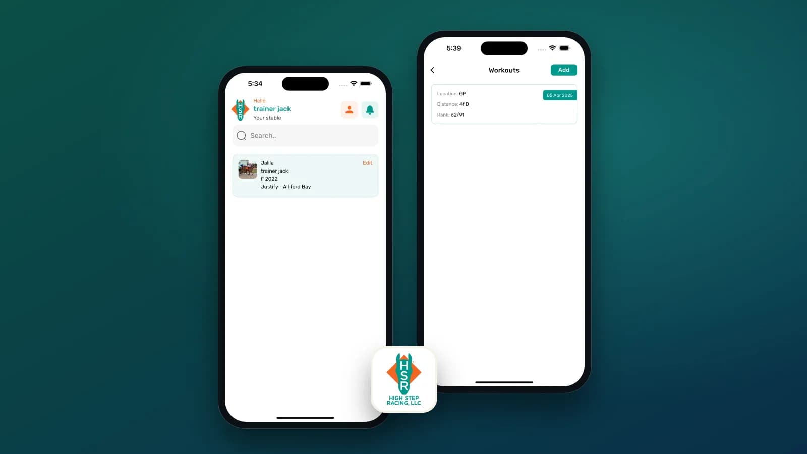 High Step Racing – Horse Racing Stable Management App
We review your product screens, existing Figma files and code to find duplicate components, inconsistent styles and gaps.
You receive UI inventory and audit report
We define color, type, spacing and other foundations as tokens, with contrast checks and theme modes.
You receive Token set and foundations in Figma
We design and build the most-used components first, such as buttons, inputs, selects, tables, modals and navigation.
You receive Figma library and coded components
Every component gets a Storybook page with examples, props, states and usage rules.
You receive Storybook documentation site
We help your team move existing screens onto the system and set up governance for changes.
You receive Migration plan and governance guide
We add components, release versions and keep the Figma library and code in step.
You receive Release notes and roadmap
Tech stack
Mobile
Frontend
Languages
Cloud and DevOps
Testing and quality
Other tools
Engagement
Audit, foundations, tokens and 15 to 25 core components in Figma and one codebase.
Multi-platform libraries, theming, documentation and migration support.
A designer and front-end developer who maintain and extend your system.
It is a shared kit of styles and components, plus the rules for using them, that your designers and developers both work from. It usually includes a Figma library, design tokens, a coded component library and documentation. The goal is that a button, form or table looks and works the same everywhere, and is built only once.
If you have one small product and one designer, a well-organized Figma UI kit may be enough. A design system pays off when several designers or teams work on the same product, when you have web and mobile apps, more than one brand, or when inconsistent screens and slow front-end work are already a problem.
It depends on how many components you need, whether we code them for one platform or several, theming needs and how much existing product must move onto the system. After an audit we send a written estimate. As a guide, a foundations-plus-core-components system in Figma and React usually costs $12,000 to $30,000, and a multi-platform system with React and Flutter libraries, theming and full documentation $30,000 to $90,000 or more (USD).
Yes, that is the most common case. We inventory what is already there, keep what works, merge duplicates and fill gaps, so the system matches your brand and your users are not surprised by a sudden redesign.
Yes. We set up Figma variables with modes for themes such as light and dark, and export them as design tokens. Style Dictionary then turns the tokens into CSS variables, a Tailwind theme, Flutter theme files or other formats, so a change in Figma reaches code through a reviewed pull request.
Mostly React with TypeScript for web, often on top of Radix UI or shadcn/ui, and Flutter for mobile and cross-platform apps. Flutter libraries work with GetX, Riverpod or Bloc state management. We match the stack your product already uses.
Accessibility is built into each component: color contrast checked against WCAG 2.2 AA, visible focus, full keyboard support, correct ARIA roles and labels, and tests with axe-core in CI. Teams that use the components get these benefits on every screen.
We use Storybook for live, interactive component docs with props, states and code examples, and can add a Zeroheight or Supernova site for guidelines aimed at designers, writers and product managers.
Foundations and a first set of core components usually take 6 to 10 weeks. A fuller system across web and mobile with documentation and migration support takes 3 to 6 months. We release in stages so your team can start using parts early.
Your team owns it. We set up governance, contribution rules and versioning so it stays healthy, and we can stay on for ongoing component work through a dedicated designer and developer if you prefer.
You do. The Figma library, tokens and component code are yours, and we work under NDA if you need one.
We start with a short discovery call under NDA if you need one. Send us your idea, any designs or documents, and the systems the work must connect to. We then share a written scope, timeline and estimate before any build work starts.
Book a call. We will look at your product and Figma files and suggest the right scope for a design system.